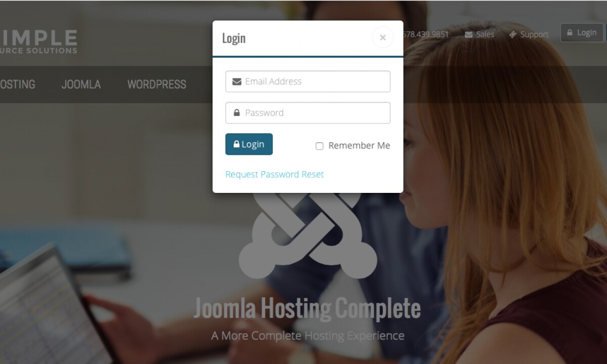
A little while back we announced our new website and are continuing to delve through all of the new plans and features. Last time, we took a look at the brand-new Simple Starter Plan. So, over the next few weeks we’re going to look at all of the new plans and new features made available in the updated client area to make managing your hosting services even easier. Today, we’re focusing on UX improvements.
With the new site we really wanted to improve the way you interact with the client area to make more tools easily accessible to you and make your experience more intuitive.
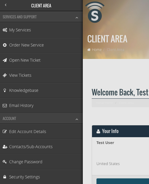
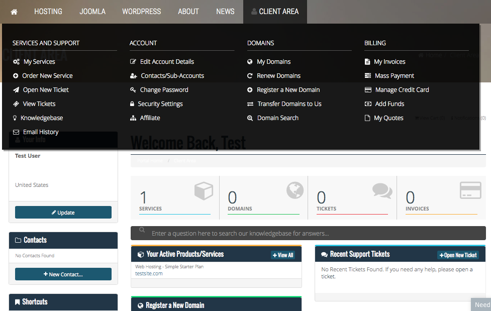
Client Area Menu
It may not seem like much, but quick, easy access to most all of your client area features from one menu really helps cut down on the amount of clicks you need to make to get to access what you need to access. To limit the need to scroll, the menu will follow along with you no matter where you are on the page. This saves you valuable time.
Fully Responsive Design
The new site and client area is fully responsive–meaning the site will scale to the size of most any device you’re using for a better viewing experience. This makes for convenient access to your account services whether you’re at your desktop or on the go from your mobile device.
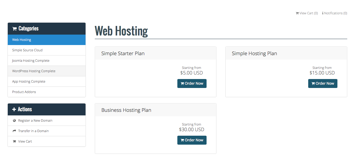
Orders Made Easy
Placing new orders is now easier than every and more intuitive. The order form is fully responsive, so, even if you need to order new hosting services for a client while on the go, it’s now easier than ever.
Today we’ve looked at UX/UI improvements to the client area. Next time we will be delving into how we made managing your hosting service even easier. Thanks for tuning in!
